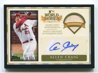
So Topps is the big dog...[edit: only dog], and after seeing the base design from this year's release (gag), I was truly thinking I was going to take a year off from buying too much topps base and getting nothing for nothing, just to bust. This will be that year...but there is more to the 2012 set than meets the eye or even the sell-sheet seen below:
The golds are here...with a sparkle not nearly as annoying as the Diamond Anniversary parallels, but look all you want for a serial #...you will not find one.
Now that we've covered the general, I am going to show you why I have been trolling ebay for 2012 topps since it really hit the secondary.
awesome. Year of win is in the pin. and there are our beloved thin gold #s again. I will have a Brooksie.
I really can't believe what I'm seeing here. I was truly a fan of the improvements made to the base inserts, but had no idea how insanely well they would translate into high-end pieces. even the sticker doesn't turn me off this one...my god, it's full of stars...
This was the insert that I got that I will be buying the set of to put in a binder to appreciate forever. This heavy hitter up here is an example of amazing design and forethought.
So clean, so fresh. So fresh and so clean. And I love these two guys.
[ The "Say Hey Kid" and2011 MVP Matt Kemp]
what? omigod. where do these come from? so sick.This has been done, we all know it. It was not, however, done when a card made out of gold is worth the price to see a game...just the gold, that doesn't include the "1/1" symbol they stamped on it. Where do these come from?
These look a little funny with the "brushed bronze" patina, but the design reigns and the symbol stands. At least I assume they are metal. My impression would be significantly changed if it were plastic, but I digress...
Looking at these cards makes me relaxed like having a dog squeezed into the big chair with me. Unlikely heroes from this WS make these family must-haves.
Damn that's hot...
Design,design,design. Holy Cow, from fonts to window cut.
(Am I just blind to manu-patches now? are you?)
This is the one I pulled from my blaster: I was over the moon. Best manu-patch yet. Really outstanding piece for my FRob collection
Did you know you could pull this? How many cut autos are floating around the web with people posting things like "how'd I do?" and "Don't know who this is, how'd I do?"...I find this annoying, but that is why I don't buy those products. But Nellie Fox? and that fade....mmmmmmmmmhistoric...Did you think you could pull this? holy shit that is one incredible card. Great photo, placement, design, color palate. excellence. I am getting amped just writing this post I am so high on these cards...
ok, that's incredible. what more could you possibly want from a case(?) hit?
Coins, whatever, this has also been done. but the coin is not embossed on the card, it is an actual coin in thick-stock that can be removed from its surroundings and is a full-size coin. How could you NOT know if one of these was in your pack?box?case?
So simply gogeous, I can't stand it anymore. And the CALIBER of players is another thing I would like to highlight here. Total Keepers up and down.
And just for good measurez: Mickz(probably from a factory set):


BzBPLOOY6!q!~~60_3.jpg)


TBPKz+qPPWg~~60_3.jpg)


Some awfully nice stuff there.
ReplyDeleteNow if they had only filled in the regular cards behind where the autographs go, they would look like nice cards.
ReplyDelete