Saturday, February 23, 2013

Trade Bait: Because My Readers Are More Important Than Money.

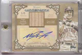
Here we go, What you guys don't want to trade for (remember I am not looking to "make out on a trade" or "get value" as that is how we do around here). See my updated sideroll for wants. I am a simple trader. Also Team needs aside form the next few posts will be handsomely hooked up as my knee is fuct again and I am moving in a year or so. Time to open the floodgates. More to come.
post a comment and email peterson238 at yahoo.


Saturday, February 16, 2013

Leaf: I Loved You In 1990: You Want Me Back Don't You

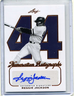
Some of the "right up my alley" collection from Leaf recent. Ok, so the UD corpse takes another kick in the ribs by use of the "Ultimate" label, but who cares when Leaf is putting out products like the following gallery. With the white stock, clean chrome, nice tiny numbers (such a sucker for tiny numbers) and autos that really stand out and exist as the paramount feature of the autographed card as it should be.


 For this design, I think the numbers are an outstanding way to draw attention away from the lack of logo or team name. The player selection lends itself to this too, as these guys made the sight of this number in the zone of competition actually meant something.

 Due to the sweet sweet filigrie(sp don't care), the PWS (plain white swatch) does not offend. The choice for the picture is key. I found a Nolan Ryan that chose his induction into the HOF...old fat man. even he would hate it.
 navy numbers, pinstripes, 44...can you even tell it's not a yankees card?
 Just about perfect without a patch. I guess, upon further review, I could do without the "film reel" banner. I don't really get it.
 Freak! If you were born between 1970 and 1980, tell me you don't want this card.
simply epic. Ditch the sticker and this would dominate my football auto collection.

I got to get my hands on one of these. Off to bid.

Peterson

Monday, February 11, 2013

If You Gotta Cut, Cut Here Part II: Ahhh...That's Better

Good ol' Bobby Doer Comes through. It doesn't hurt that it appears to be inscribed by a well-seasoned, but not dull, sharpie on a very conducive surface like a program or an 8x10. You can't really even tell that Bobby's pants(?) are making a cameo. Dirt background....AAAHHHHHHH....so relieved.

Saturday, February 9, 2013

2013 Topps; I Will Be Re-Dipping In This Pool (MINE)

 This should net me a few bucks. I do love the pink look, and with them being the (slightly) shorter-printed SPs, it's a decent addition to the Black #/XX. Minny Miggy...we'll see about that.
 I did nab Bundy, Miller and Olt Blues (along with Harper below) Would have Preferred a Profar.


 The emerald stuff is better than the gold and now I know I cannot go back.
I do dig Carlos alot for an Ohioan, and these cards are a really attractive alternative to the "chasing the whatever" 2004 Finest redux cards. (phew)

2013 Topps: A Break To Break The Hardest Breakers


So I was an upper deck man when they were around. Nowadays I have been riding the "show me what you got, Topps train that started in 2010. This is the first base release since then that has grabbed my interest. I haqve compiled a few images from ebay and other sites to show you the simple answer as to why I want to buy another hobby box ASAP. I don't think I've said that since 2006 BoChro. Anyway, on with the show. Your welcome Topps.
 I bid on this one but it got away. I love the use of silver and the "brushed" or "galvanized" look of the softened areas of chrome. It really adds a look of true distinction that I feel topps has previously really missed the mark on. (uhem 2008 clown show)

 The relics available are amazing, even in a world of relic-tired cynics like myself. Bob Clemente? Yes, please. All day long.
 Dedication to memorializing the Fall Classic have been strong with topps, but with mixed results. This year's look great. (Last year's were amazing with the leaves and what-not)
 I gotta let the rest speak for itself. Let's just say that I am excited for my Box break. The ossibilities are endless, but the break is limited. Stay tuned for my personal hits and a review of the "silver slate" cards when they arrive.


 upper deck did it.


Remember What I Was Saying About Cutting?; Oh Go No.

 This doesn't even offend me at first, due to the adequate centering of the sticker, then I realize it is a "cut signature" which it is not. then comes the part about it being from a previously-released card...from Tristar's basement...of Mark Reynolds. I mean, you can clearly see his torso there.
Then I look at the bottom of the card...Baltimore NOW?

...so it would stand to reason that if this side were "Baltimore NOW"...

 ...then the other side would logically be a third baseman from "Baltimore......


NOOOOO!!!!!
It's a previously-released base card auto!
and the original player name is partly showing, the head is mostly not!
and it's cut for shyte!
and the backing is showing!
 AND THEY DID THIS ON PURPOSE!


ludicrous.
-Peterson

Wednesday, February 6, 2013

No Honor in Braun; Investigation Equates to Tar On Roadway

COME ON MAN!
I mean, information is only used against you if you actually generate it!
this is bad for me and baseball...like 1994 bad....